PROJECT TYPE
Freelance Project
Project Overview
TIMELINE
3 Weeks, February 2024
MY ROLE
UX Researcher
UX/UI Designer
Project Manger
TOOLS
Figma
FigJam
Adobe Photoshop
Pen & Paper
PROJECT BRIEF
After completing a 12-week UX Design bootcamp, I felt that I had well familiarized myself with designing and prototyping for mobile applications. Now I wanted to step out of my comfort zone, so I decided to take on a new challenge. This time, I decided to try web design.
I stumbled upon this opportunity through a graphic designer friend who showed me an online marketplace that also functions as a portfolio. My client, who runs her own brand called Ugly Mall Rat, specializes in selling her own hand-made merchandise. Additionally, she has created various art pieces independently or for school projects, and so finding this website motivated her to make something similar.
This is where I stepped in.
I proposed to design her a similar type of website to showcase all her works, providing her with a platform she can either further develop or simply draw inspiration from when building her own portfolio in the future.
Here is my process.
DESIGNING METHOD
Content-First Design Process
Since UglyMallRat is already an established brand with its own variety of content, I chose to tackle this project with a content-first design approach.
The content-first design method prioritizes the creation and organization of content before addressing design elements such as layout and visuals. This ensures I am staying true to the brand's voice and style while maximizing existing resources. Ultimately, it is all about delivering the best possible user experience and making sure that I am hitting the goals I have set for this project.
SITE MAP
Before diving into the design phase, I needed to figure out my desired actions that users would take for the site. To accomplish this, I created a site map to outline its structure. This allowed me to identify all the necessary pages and screens, which would help facilitate a clear understanding of the required content to fill the site effectively.
Given that the site would serve two distinct purposes—showcasing a portfolio and operating as an e-store—my primary goal was to ensure seamless navigation for users between these two key content sections.
RESEARCH
Competitive Analysis and UI Inspiration
To gain a clearer vision of the site's aesthetics and features, I conducted a competitive analysis and gathered design inspiration from fellow online artisans. By visually auditing various e-commerce stores, I identified key elements to incorporate into my design, organizing my findings into a UI inspiration board.
SKETCHING
With all my ideas gathered from my UI inspiration board, it was time to commence the design process. The initial step involved outlining how I envisioned these screens. I created several iterations, then narrowed it down to the final design with the most potential.
GREY-SCALE WIREFRAMING
Now that I knew what my screens would look like, I began designing grey-scale wireframes.
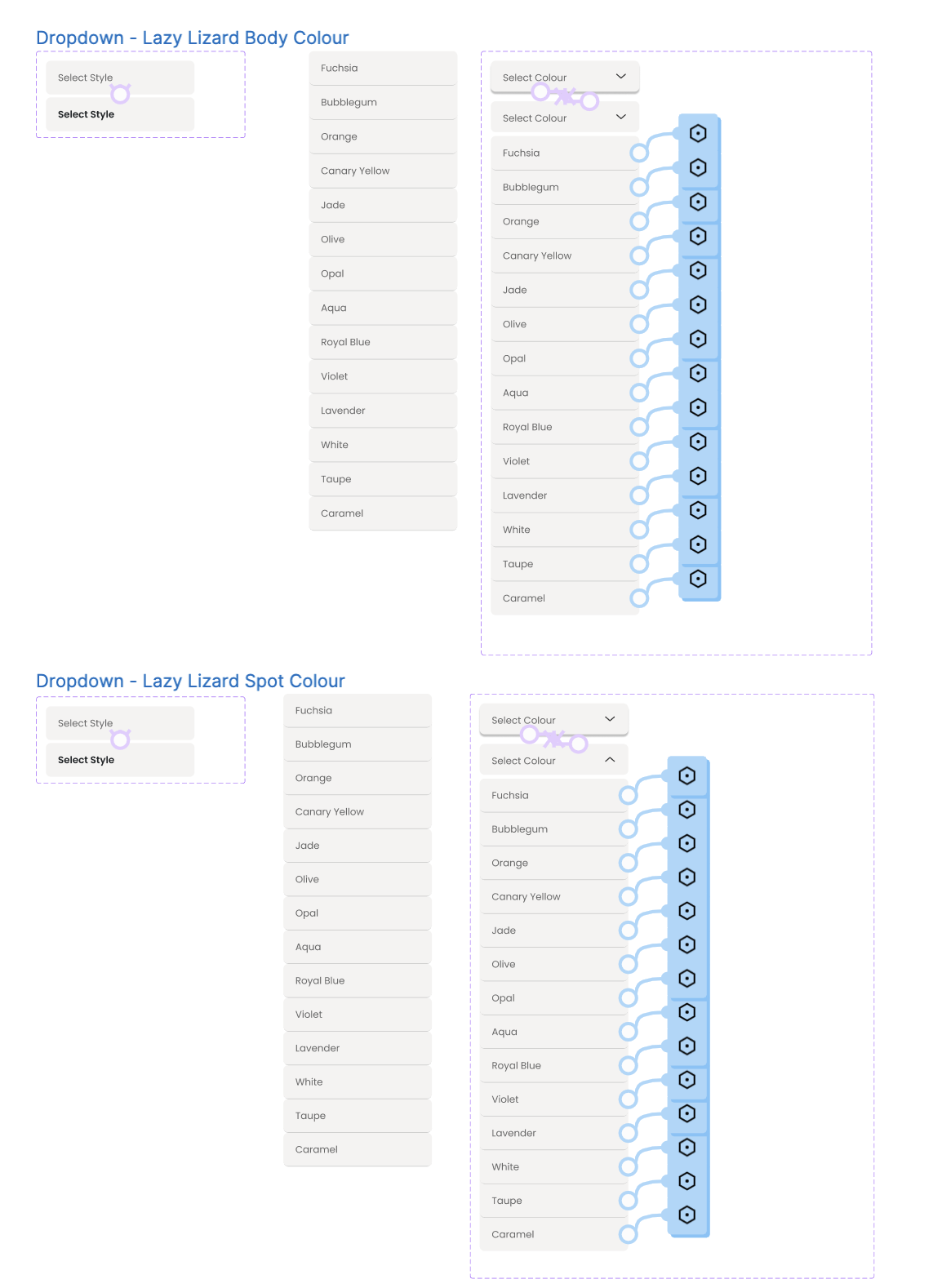
The most challenging aspect of this project was implementing the drop-down boxes.
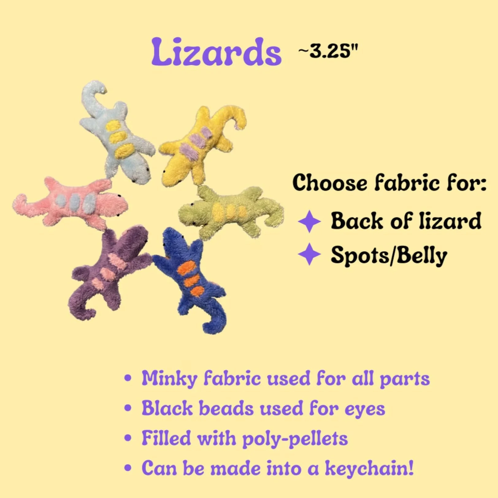
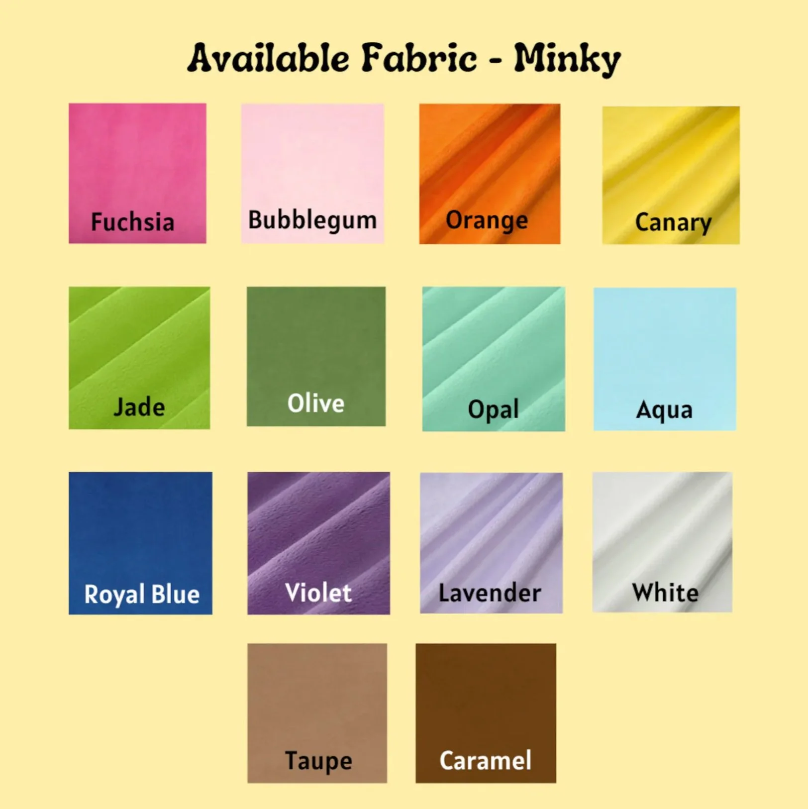
Since certain plushies offered customization with various colour options for specific body parts, I had to replicate the same box with identical lists. The complication began when selecting a style or colour required the drop-down box label to update accordingly.
To achieve this functionality, I utilized variables, but encountered several bugs due to the extensive list of colours. Selecting an option from one box would inadvertently alter the label of the next box or prevent it from opening altogether after the initial selection.
Despite these hurdles, I persevered and successfully resolved the issues, gaining valuable insights into variable usage along the way.
USER TESTS
I conducted a single round of user testing involving five participants to evaluate the effectiveness of my design. Feedback from each user emphasized the simplicity and clarity of navigating between the personal work and the shop sections, resulting in mostly positive responses and very minimal criticisms. Given the straightforward design, most suggestions for improvements centred around fine-tuning the overall layout, particularly adjusting spacing between objects and sizing of components.
USER INTERFACE
Now came the essence of this design project, which was establishing the visual identity of the UglyMallRat.
During discussions with my client, she outlined five adjectives she wanted the site to embody: playful, cute, organized, professional, and welcoming.
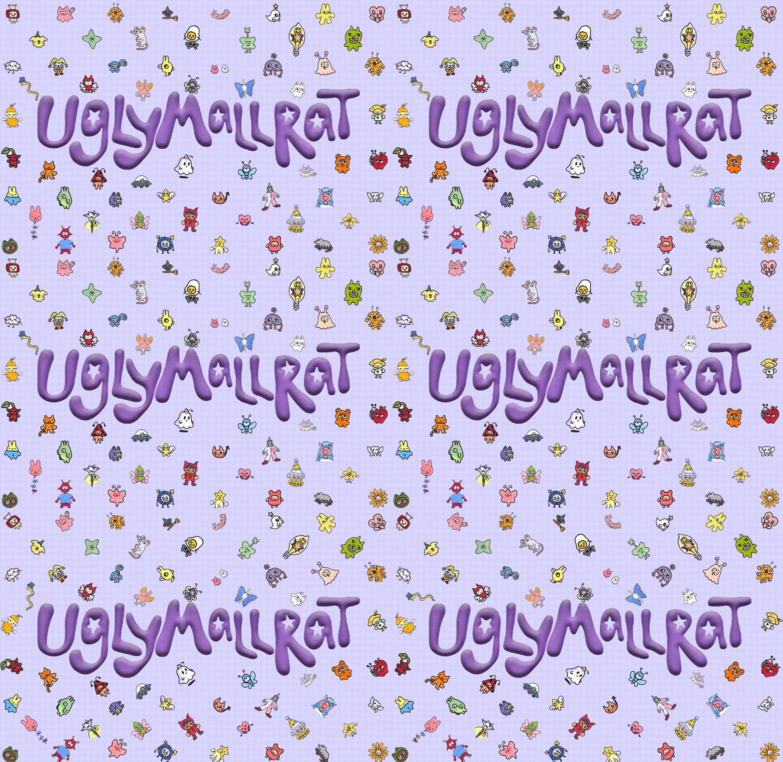
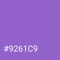
Many of my colour design choices were influenced by the specific shade of purple featured in this version of the logo.
For typography, I kept it simple and chose Poppins for its playful look and clear legibility.
After capturing this colour, I positioned it within a colour wheel to explore potential palettes. While I was initially drawn to the analogous scheme, I found it too light when applied to the header and footer.
Experimenting further, I adjusted the shades to my preference, ultimately achieving a version that complemented the logo well and really made it pop!
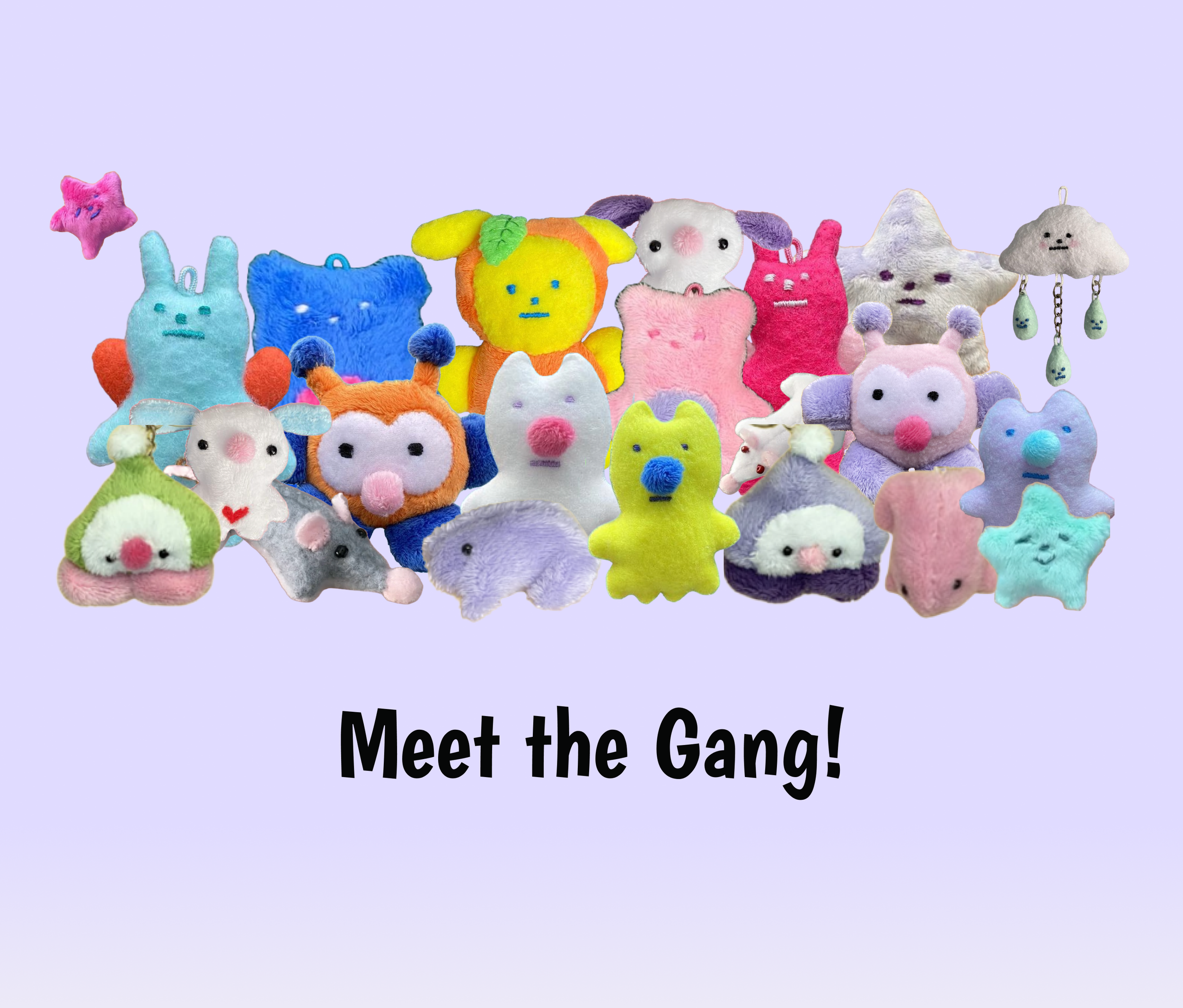
Since I had been provided with product shots, narrowing down my colour schemes was straightforward. With the backgrounds of these shots spanning various pastel colours, I immediately decided that the accent colours would consist of a select few pastels to complement the bold brand colour. These would be used as backgrounds for different category cards.
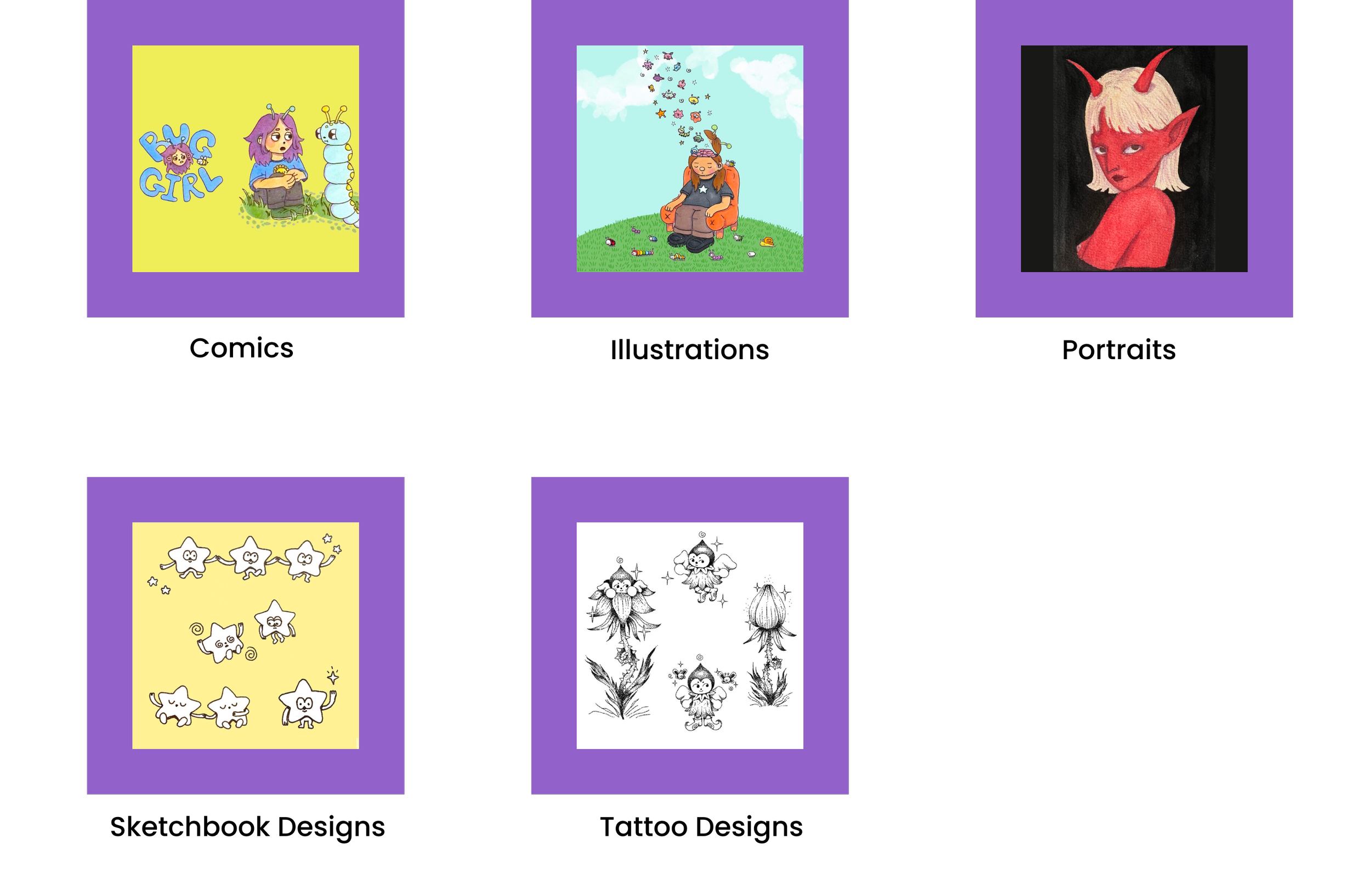
I wanted to differentiate the aesthetics between the work and shop sections. Considering the diverse colours and styles of the provided artwork, I opted for a more cohesive and professional look in the work section, utilizing consistent background colours.
Drawing inspiration from the shade of purple used in the navigation bar and footer, I sought out another analogous scheme.
From the available colours, I selected one to serve as the background for the main art categories. I then returned this chosen colour to the colour wheel and used the provided monochromatic colours to differentiate the covers of art within each specific category.
PROTOTYPING AND ANIMATING
After incorporating all the text, colours, and content, I noticed that the design felt somewhat plain. I found myself constrained by the limitations of screen transitions, as I felt they were not realistic to how most e-commerce sites move and just added a frustratingly longer amount of time for users trying to navigate the site.
Instead, I decided to incorporate more movement into the site's content, particularly the cards for each category, product, or art piece. This approach aligned well with the playful vibe I aimed to achieve, striking a balance without overwhelming users.
Additionally, I introduced more modals to appear during specific interactions, such as providing a confirmation message when users add items to their bag.
After I had finalized all my designs and details, I was ready to present the final prototype!
My client particularly appreciated the chosen colour scheme and the hero shot I crafted in Photoshop. The animated elements were well-received, adding a nice touch to the design, and the overall organization was praised.
The few suggestions of improvement I received included finding an alternative background colour for the stickers, as the green clashed with the yellow. After exploring options, we settled on a softer shade of pink that complemented the design seamlessly.
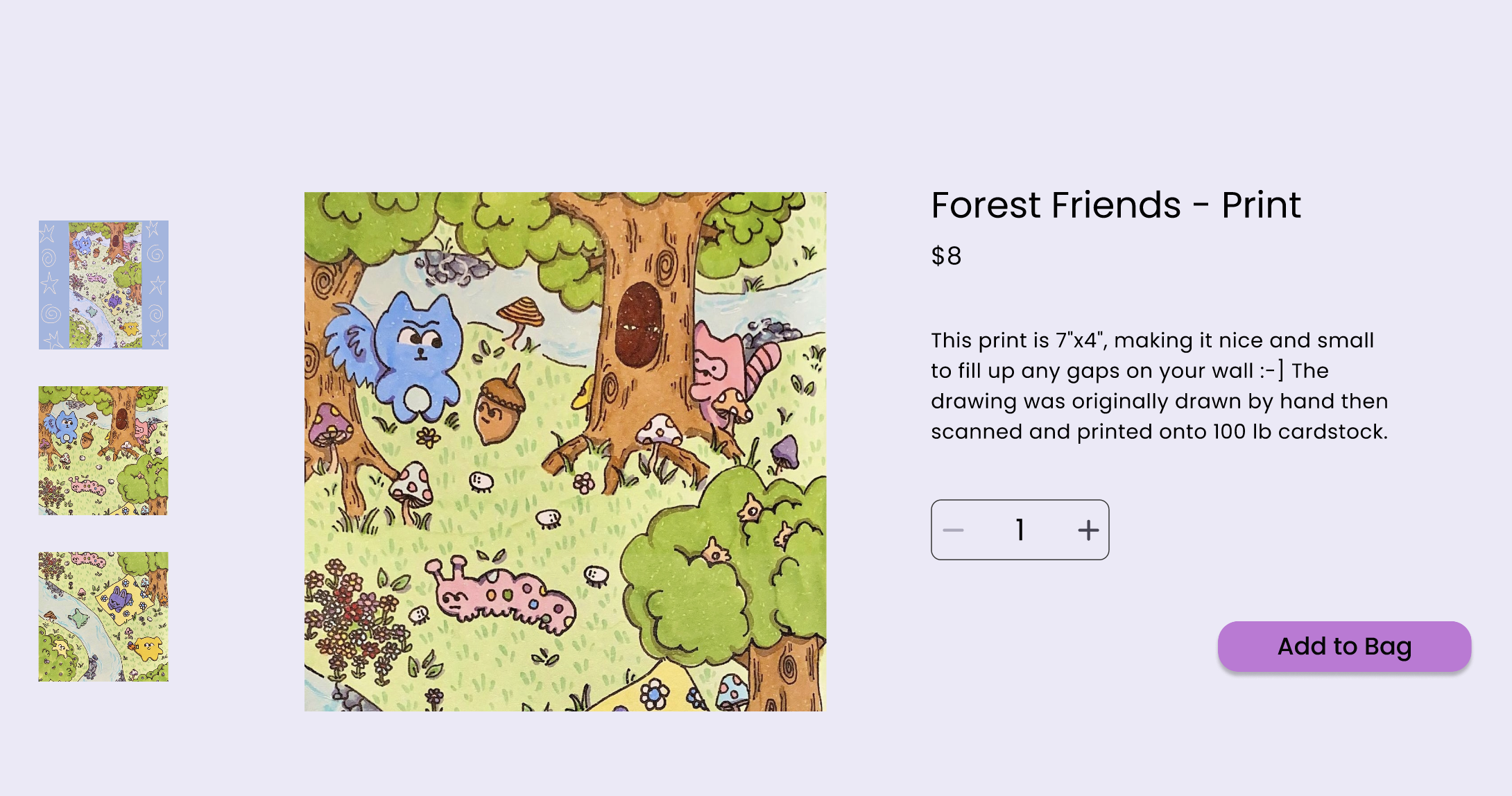
I also provided two options for the appearance of selected product images for her to consider. Ultimately, we decided to replace the circles of the pagination indicators with small preview images while retaining the navigation arrows.
However, we agreed to maintain the original circles when viewing the selected comic series.
CLIENT FEEDBACK
FINAL PROTOTYPE
KEY LEARNINGS
This was a very fun project, and I am grateful for the opportunity to have worked on it.
It involved exploring many new concepts for me, such as content-first design and web design with variables, which significantly helped improve my skill set. This experience has peaked my interest in UX design and provided me with valuable insights.
Working with cute and fun content was an added bonus that made the project even more enjoyable!
While my client may not be implementing a site like this anytime soon, I am pleased that my creativity has inspired and motivated her to design her own portfolio.
And That’s All She Wrote!
Thank you for taking the time to read my Ugly Mall Rat case study! Don’t hesitate to check out my other case studies or reach out if you have any inquiries! ☺️

