TRANSITTRUST
Uniting Solo Travellers Across International Transit Hubs Everywhere
PROJECT TYPE
Academic Capstone Project
Project Overview
TIMELINE
10 Weeks, Fall 2023
MY ROLE
UX Researcher
UX/UI Designer
Project Manger
TOOLS
Figma
FigJam
Artboard Studio
Google Meet
Pen & Paper
DISCOVERY OF PROBLEM SPACE
Solo Travel Can Be A Tense Experience
Have you ever found yourself stuck in a situation where a stranger has approached you in public while you were alone and persistently tried talking to you, making it uncomfortable to reject them due to the concern of not knowing how they will react? This scenario is all too common for women, who often encounter such situations and become accustomed to them by the time they reach adulthood—a period often marked by self-discovery with a desire for solo international travel.
This was a topic I have been curious about, as it resonates with my own experiences. When I felt mature enough to start solo travelling, while researching, I was alarmed by the abundance of safety tips specifically aimed at women. So how can women feel comfortable embarking on these self-discovery journeys when they know they must always be on high alert?
DESIGNING METHOD
Design Thinking Process
THE SOLUTION
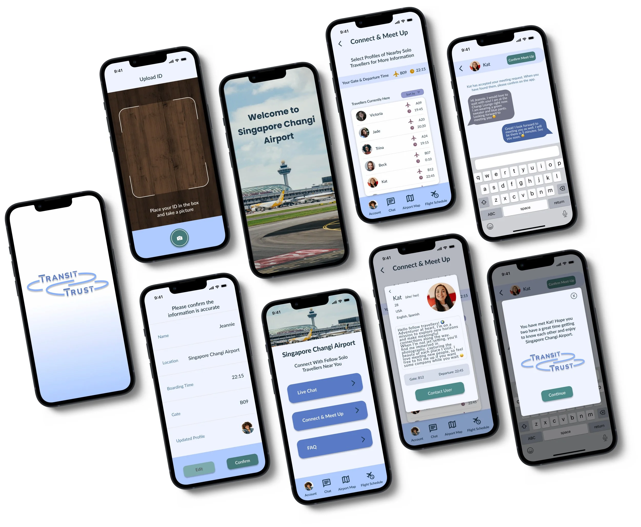
I created an app to help solo travellers at the same transit hub connect with each other. The goal is to enable meetups, offer a solution to avoid unwanted attention in an unfamiliar place during layovers, and encourage consensual interactions and companionship amongst users.
I realize that I cannot personally prevent all harassment of women travelling alone in international countries due to different global cultural standards. So I believe focusing on safety in transit hubs offers a more practical solution, creating confidence all the way from the start of the journey.
SECONDARY RESEARCH
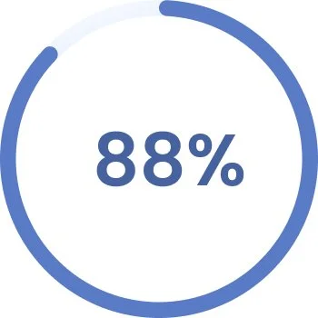
If 84% of solo travellers are women, what is the issue?
of women have stated they have felt somewhat uneasy or threatened while travelling alone
Source: ITIJ
Source: Condor Ferries
USER INTERVIEWS
Based on what I had learned through my secondary research, I then conducted three interviews with women from Toronto between the ages of 20 and 30, who have gone on their own solo journeys. I wanted to get a sense of what makes them feel unsafe when travelling alone and what exactly they do to ensure their safety in transit hubs.
Hannah (22)
“I’ll spend my time waiting by talking on my phone to limit the possibility of someone trying to approach and disrupt me.”
Hannah M. 22
INTERVIEW KEY INSIGHTS
EMPATHIZE
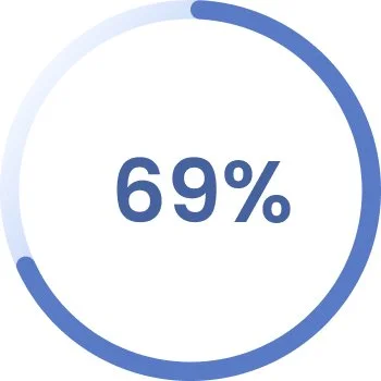
of women worry about their personal safety when travelling alone
Source: Statista
Lizzie (24)
“I’m always on high alert, and I try to stay closer to areas with more workers.”
Raven (30)
“I sit near mothers or large families to blend in and look less like I’m by myself.”
Despite desiring the freedom to do things independently, women often avoid appearing alone. Having strangers, particularly men, unexpectedly approach them puts women on high alert. All interviewees expressed reluctance to firmly request to be left alone, fearing potential harassment for rejecting unwanted advances. A common technique mentioned by all participants to navigate these interactions was to seek out spaces near families or other solo women to avoid appearing alone themselves.
Considering this technique, I thought of connecting with other solo travellers as a potential solution for my problem space. However, some interviewees highlighted a challenge with this approach, stating reservations about initiating conversations with strangers. They voiced concerns about potentially making others uncomfortable and contributing to an experience they were actively seeking to avoid.
of women feel less secure travelling alone due to the ongoing media coverage of sexual harassment and assault
Source: Journey Women
improve the experience for women travelling alone in transit hubs in order to make their journeys feel safer and more comfortable?
Keeping the User and Their Experience at the Centre of My Design
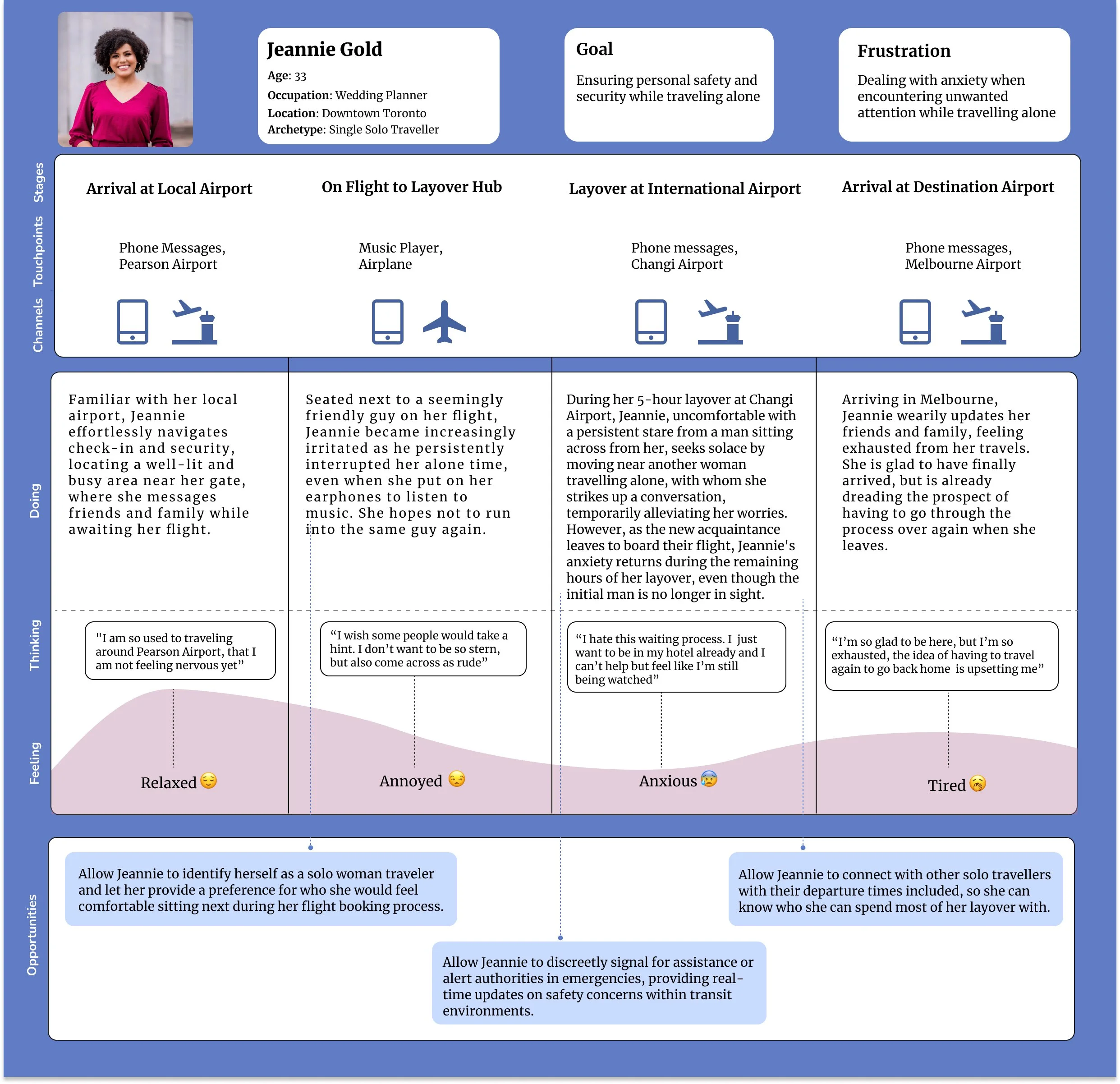
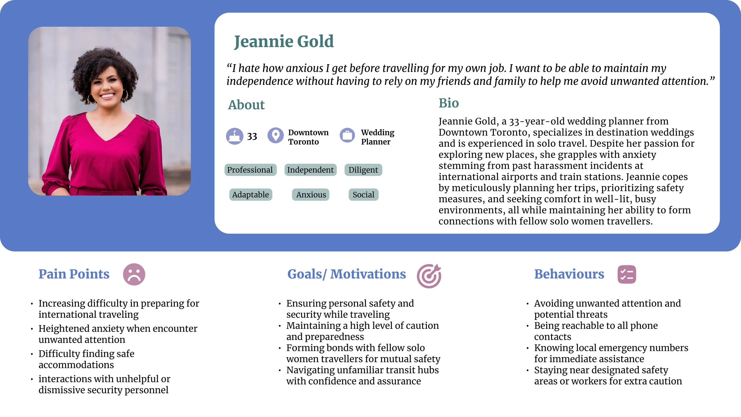
Based on my main question and the insights I had gathered from my interviews, I immersed myself in the perspective of a hypothetical user in this situation. I created a persona and user experience map to guide my design process for the target users and find areas where my digital solution can be helpful.
Jeannie Gold is a wedding planner who frequently travels alone, as her job often involves destination weddings. But because of too many unwanted interactions from strangers in transit hubs, she has started to dread travelling for work. She only feels safe when she is around other women.
EPICS & USER STORIES
Building off of Jeannie and her travelling experience, I made 26 user stories to identify potential digital tasks that would help her feel safer when alone in transit hubs. I then categorized them into three epics to better visualize where design improvements could be made, and chose the most relevant one as the main focus.
When Jeannie has to travel to Melbourne for work, she is quite relaxed and familiar with the initial arrival at her hometown airport. However, after a series of events travelling to her connecting airport and waiting during layover, she grows increasingly annoyed and anxious, to the point where once she reaches Melbourne, she is exhausted over the thought of having to do the whole process again.
Communication
“As a solo female traveller, I want to connect with fellow solo travellers in the same transit hub so that I can have company that I am comfortable being with while I wait for my next departure. ”
With this problem in mind, I then thought of the question:
How Might We
PERSONA AND USER EXPERIENCE MAP
DEFINE
TASK FLOW DIAGRAM
IDEATE
Creating Screens From Identifying Yourself to Connecting with Nearby Solo Travellers
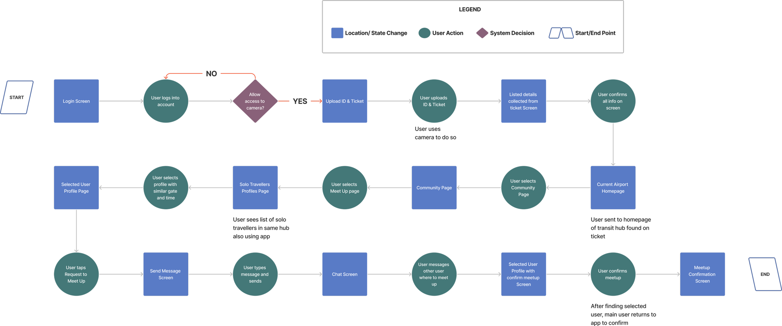
Based on my core epic of communication and with a focus on my chosen user story, I created a task flow diagram that outlines Jeannie’s process of connecting to other users in the same transit hub.
This diagram illustrates Jeannie confirming and securing her identity to ensure that it is actually her using the app. This process aims to help her meet other people in the same airport whom she can wait with during her layover.
SKETCHES & WIREFRAMES
Finding Inspiration and Creating Different Designs with Pen and Paper
The next step was to define my app design.
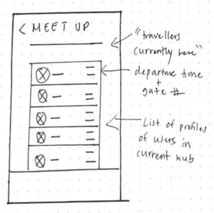
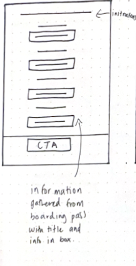
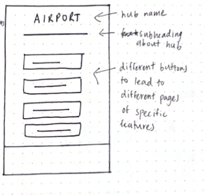
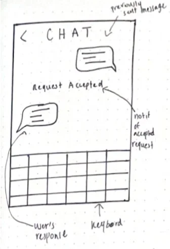
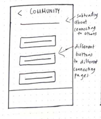
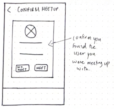
I started by brainstorming screen ideas and looking into various UI features and existing apps for inspiration. I drew multiple iterations of each screen, narrowed down the features and screens I thought to be the most optimal solution, and came up with these final designs.
Login Screen
User Profiles Screen
Upload ID/Ticket Screen
Selected User Screen
Confirm Collected Info Screen
Message User Screen
Hub Homepage Screen
Personal Chat Screen
Community Page Screen
Confirm Meetup Screen
LOW-FI WIREFRAMES
PROTOTYPE
Aiming to Help Users Complete Tasks in the Simplest Steps
Now that I knew what my screens would look like, I began designing grey-scale wireframes. I focused on making this process as simple as possible, as I wanted to avoid having an overly complex design.
The following screens illustrate the user’s process of verifying their identity and connecting to their current transit hub. Here, they would select a user with the most similar gate and departure time to request a meet-up, so they could spend their layover period together.
Login Screen
User Profiles Screen
Message User Screen
Hub Homepage Screen
Selected User Screen
Community Page Screen
Personal Chat Screen
Confirm Collected Info Screen
Hub Landing Screen
Confirm Meetup Screen
Upload ID/Ticket Screen
USABILITY TEST: 2 ROUNDS
USER TESTING
Understanding Users and Identifying Usability Problems
With these mid-fi wireframes, I conducted 2 rounds of usability testing with a total of 10 participants to identify potential usability issues. This process provided firsthand insights into how users would engage with the application and helped me assess what was missing and what should be removed from each screen.
After each round, I took the feedback and sorted the advised design changes into a prioritization matrix, focusing on aspects that were both low-effort to fix and had a high positive impact for users. Since I managed to have enough time to make additional changes, I also tackled high-effort, high-impact, and low-effort, low-impact design changes.
-
Adjust button sizes
Create two separate screens for each upload.
Change collected information to left alignment.
Combine ‘Hub Homepage’ screen and ‘Community’ screen into one screen.
Move ‘Flight Schedule’ and ‘Airport Map’ onto navigation bar. Move ‘Report’ onto navigation bar on ‘Meet-up’ screen
Include “Jeannie’s” departure time and gate number above list of profiles.
Remove ‘Message’ screen and move it onto ‘Selected Profile’ screen as a button.
Move ‘Confirm Meetup’ button onto ‘Chat’ screen.
-
Add a progress bar for each identity upload.
Include a feature for user to take picture of themself within hub when using app for easier identification during meetups.
Add an ‘Upload from files’ button for possible saved digital tickets.
Include a description of selected user, their age, country of origin, pronouns, and fluent spoken languages.
Include a final confirmation message after user confirms meetup.
FINAL GREY-SCALE PROTOTYPE
BRAND IDENTITY
IMPLEMENT
Establishing the Tone and Enhancing the Experience
After finalizing all my screens, I started brainstorming my brand's visual identity in order to create a complete, high-fidelity prototype. Here, I selected my colours, typography, tone, and various design elements to complete my brand. To achieve this, I developed a moodboard, identified adjectives that I felt embodied my brand, and played around with accent colours.
BRAND COLOURS AND TYPOGRAPHY
I chose blue as the main brand colour to evoke a sense of trust and reliability, aligning with my app's commitment to providing a secure and dependable experience for users. I ensured that these chosen colours align with the Web Content Accessibility Guidelines (WCAG), guaranteeing AA-AAA accessibility to accommodate all users, irrespective of visual impairments.
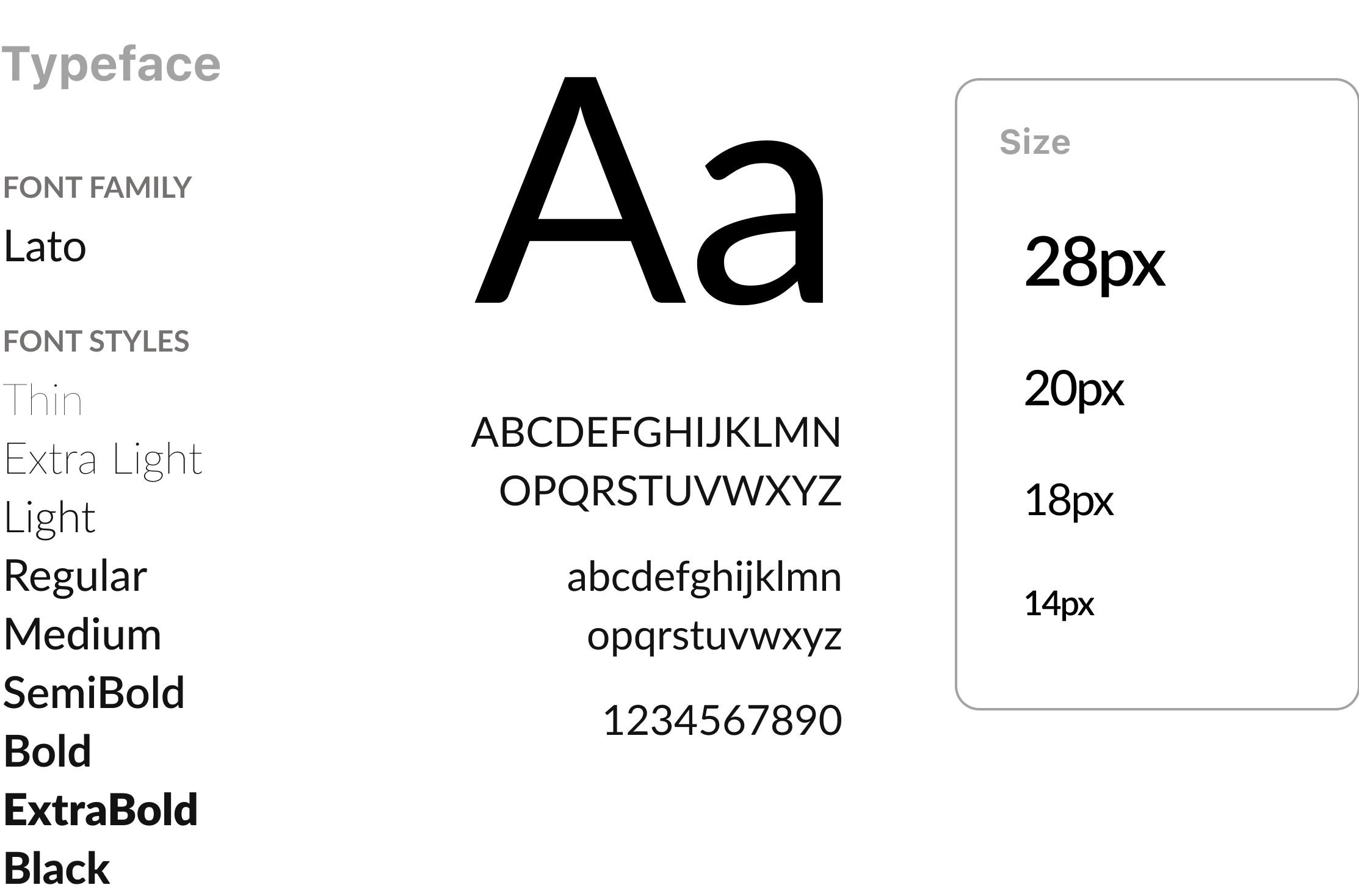
Lato was selected as a typeface for its clean, modern, and legible style, creating a harmonious and sophisticated visual appeal that aligns with my app's commitment to a friendly and accessible user experience.
WORDMARK & ICON DEVELOPMENT
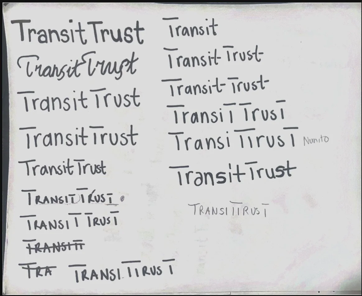
After settling on the brand name TransitTrust, I designed several variations of potential wordmarks and icons.
I knew having four T’s would be the key aspect that I would play around with to see what looked best visually.
After finalizing the brand name, I tried different styles of typography, sizing, and spacing of the letters. I really liked having all the T’s capitalized and leaving gaps between the horizontal and vertical lines of the letter, with the last T’s of each word being smaller than the first letter.
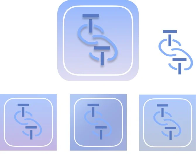
When I designed my wordmark, I thought to also implement the link symbol on it. I played around with different shades of the same colour and added a drop shadow to really make it pop.
I tried different variations of what I could make my icon symbol look like. I chose to use a link icon with two T’s, as it best presented the concept of connections. I tried it in different arrangements and stuck with the diagonal positioning.
I had previously tried using a gradient colour scheme within my app design. However, as it was not working well, I came back to this idea for my icon, using similar shades of blue, indigo, and purple to match my primary brand colour.
FINAL PROTOTYPE
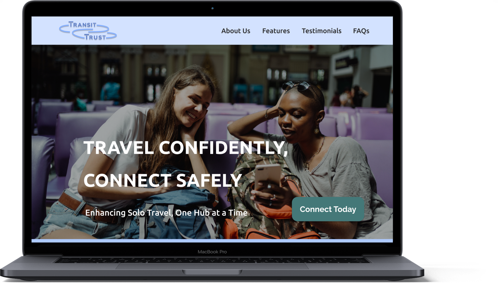
MARKETING SITE
Now that TransitTrust is completely finished, it is ready to be shared with the public, and so I have made a marketing site to promote it.
PROMOTION
DESING IMPACT & FUTURE THINKING
Impact
Reflections
Next Steps
TAROT CARDS OF TECH
TransitTrust strives to make a meaningful impact by elevating the safety and comfort of solo women travellers in transit hubs. By facilitating connections and encouraging consensual meetups, it aims to minimize vulnerability to unwanted attention. This approach not only fosters a positive and empowering experience but also seeks to redefine the narrative surrounding solo travel for women, fostering inclusivity and enjoyment.
Although initially centred on women's safety, I realized the significance of adapting the language to promote inclusivity in my app. Acknowledging diverse gender identities and expressions, I believe incorporating pronouns was a positive step in attempting to be inclusive and empowering users to select connections aligned with their individual preferences. I am committed to further exploring and improving inclusivity within the app.
I will be actively refining additional features on my app, such as the airport map and live chat functionality, with a focus on usability through ongoing testing. Continuing this iterative process, I aim to enhance UI elements and accessibility components to ensure they are in their optimal form for an improved user experience.
-
A community of passionate TransitTrust users would actively engage in fostering a supportive and collaborative environment. They may share travel experiences, safety tips, and connect with fellow users, contributing to a sense of camaraderie and shared purpose.
-
TransitTrust relies on rules of respectful and consensual engagement. Users are expected to prioritize safety and considerate interactions. Subversion could occur if individuals misuse the platform for inappropriate or harmful purposes, undermining the intended positive and secure environment.
-
The community could be an asset by providing valuable insights, support, and a sense of security for solo travelers. However, it could become a liability if there are instances of misuse or if negative interactions compromise the intended positive atmosphere, potentially deterring users.
And That’s All She Wrote!
Thank you for taking the time to read my TransitTrust capstone project! Feel free to check out my other case studies or reach out if you have any inquiries! ☺️

